Mastering Project Trajectory: A Deep Dive into Burndown Charts
Burndown charts are a powerful tool for visualizing project progress and predicting completion, offering a clear snapshot of project status. Understanding and effectively utilizing burndown charts is essential for professionals seeking to optimize their project workflows and proactively address potential roadblocks.
In the dynamic world of project management, staying on track is paramount. A powerful tool for visualizing progress and predicting completion is the burndown chart. This visual aid offers a clear, concise snapshot of project status, enabling teams to proactively address potential roadblocks and ensure timely delivery. For professionals seeking to optimize their project workflows, understanding and effectively utilizing burndown charts is essential.
What is a Burndown Chart?
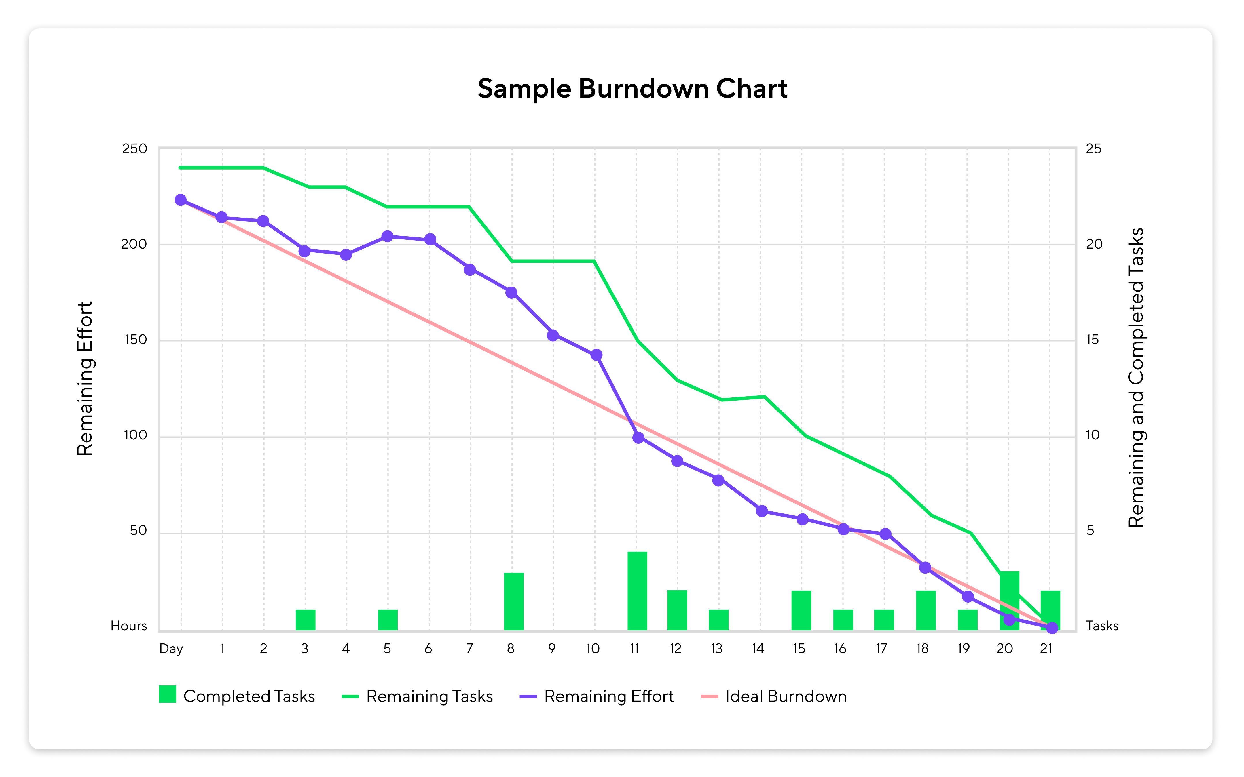
At its core, a burndown chart is a graphical representation of work remaining versus time. It illustrates the amount of work left to be completed against a predetermined timeline. By comparing the actual work completed to the ideal progress, project managers and teams can quickly assess whether they are on schedule, ahead, or behind. This provides a crucial feedback loop, allowing for adjustments to be made and resources to be reallocated as needed.
Key Components of a Burndown Chart
A typical burndown chart consists of several key elements:
- X-axis: Represents the timeline of the project, typically measured in days, weeks, or sprints. Some Agile teams may use story points as a unit of time.
- Y-axis: Represents the amount of work remaining, quantified in hours, tasks, or story points.
- Ideal Line: A straight line that depicts the projected rate of work completion, assuming consistent progress throughout the project. This serves as a benchmark for comparison.
- Actual Line: Represents the actual amount of work remaining at any given point in time. This line fluctuates based on the team's progress.
Benefits of Using Burndown Charts
The adoption of burndown charts offers numerous advantages for project teams:
- Early Identification of Delays: By visually comparing the actual progress against the ideal line, potential delays can be identified early on, allowing for proactive intervention.
- Improved Scope Management: Burndown charts help teams manage scope creep by providing a clear view of the remaining work. This ensures that the project stays within its defined boundaries.
- Enhanced Resource Allocation: When a project falls behind schedule, burndown charts can highlight the need for additional resources or a reallocation of existing ones.
- Increased Team Transparency: Burndown charts promote transparency by providing a clear and accessible view of project progress to all stakeholders.
- Data-Driven Decision Making: The visual data presented in a burndown chart supports informed decision-making regarding project scope, timelines, and resource allocation.
Types of Burndown Charts
While the basic concept remains the same, burndown charts can be adapted to suit different project needs:
- Sprint Burndown Chart: Tracks progress within a single sprint, common in Agile methodologies.
- Epic Burndown Chart: Visualizes progress towards completing an epic, a large body of work that can be broken down into smaller stories.
- Release Burndown Chart: Monitors progress toward a release, which may encompass multiple sprints or epics.
- Burnup Chart: Unlike burndown charts, burnup charts track the amount of work completed over time, as well as the total scope of the project. This is especially useful when the project scope is likely to change.
Creating and Utilizing Burndown Charts
Creating a burndown chart is relatively straightforward. First, define the total amount of work required for the project or sprint. Then, track the amount of work remaining at regular intervals (e.g., daily or weekly). Plot this data on a chart, along with the ideal line. Regularly review the chart with the team to identify any deviations from the plan and discuss potential solutions.
Tools for Burndown Chart Creation
Several project management tools offer built-in burndown chart functionality, automating the tracking and visualization process. These tools often provide features such as real-time updates, customizable charts, and integration with other project management features. Some popular options include:
- Wrike: Offers comprehensive project management capabilities, including robust burndown chart functionality.
- Jira: A widely used Agile project management tool with extensive support for burndown charts and sprint tracking.
- Asana: Provides visual project management features, including burndown charts and task tracking.
- Trello: A flexible and intuitive project management tool that can be adapted to create burndown charts using power-ups or integrations.
- Monday.com: A versatile work OS that allows teams to visualize project progress with customizable dashboards and charts.
Best Practices for Burndown Chart Implementation
To maximize the effectiveness of burndown charts, consider these best practices:
- Accurate Estimation: Ensure that the initial estimate of work is as accurate as possible. This will provide a more realistic baseline for tracking progress.
- Regular Updates: Update the burndown chart regularly (e.g., daily or weekly) to ensure that it reflects the current status of the project.
- Team Involvement: Involve the entire team in the creation and review of the burndown chart. This fosters a sense of ownership and accountability.
- Transparent Communication: Use the burndown chart as a tool for transparent communication with all stakeholders. This keeps everyone informed of project progress and potential challenges.
- Adapt and Adjust: Be prepared to adapt and adjust the burndown chart as needed. Project scope, timelines, and resources may change over time, so the chart should be updated accordingly.
Conclusion
Burndown charts are invaluable tools for project managers and teams seeking to visualize progress, identify potential delays, and ensure timely project completion. By understanding the key components of a burndown chart, implementing best practices, and leveraging available project management tools, professionals can effectively utilize this visual aid to optimize their project workflows and achieve their goals. As projects become increasingly complex, the clarity and insight provided by burndown charts are more critical than ever.
Related Tools
Related Articles
Beyond Policy: How Wrike's 'Women of Wrike' Initiative Empowers Female Professionals
Wrike's 'Women of Wrike' (WoW) initiative is an employee-led program empowering female professionals through mentorship, workshops, and networking. WoW addresses challenges women face in career advancement, fostering a supportive environment and promoting equity within the company.
Bridging the Gap: Integrating Construction Project Management with QuickBooks for Financial Harmony
Integrating project management software with QuickBooks streamlines financial workflows, reduces errors, and enhances communication for construction teams. Key features to consider include job-level tracking, progress invoicing, and time-based labor cost allocation.
Wrike Streamlines Franchise Onboarding for Buzz Franchise Brands, Boosting Efficiency
Buzz Franchise Brands streamlined its franchise onboarding process using Wrike, transforming a fragmented, multi-platform system into efficient, centralized workflows. This resulted in significant time savings, improved task tracking, and enhanced visibility across teams, enabling the company to scale its franchise operations more effectively.